
Basic Typography Terms for Middle and High School Students
This lesson is a part of a media literacy Project Based Learning (PBL) Unit for middle school students. Through a series of 10 lessons on the elements of art, user research, branding, UX design, and project management, students will collaboratively design a new website for their school.
In this mini-lesson, we’ll define basic typography terms as a primer to graphic design and branding.
Why does this matter?
Children now receive information from media all around them — television, movies, social media, advertising, music, and more. Therefore, literacy instruction must expand beyond the traditional written word to reflect the myriad of sources we receive information in contemporary society. In 2019, the NCTE created a new definition of “literacy in a digital age,” arguing that “active, successful participants in a global society” must be able to:
“Explore and engage critically, thoughtfully, and across a wide variety of inclusive texts and tools/modalities” (NCTE, 2019)
“Consume, curate, and create actively across contexts” (NCTE, 2019)
“Advocate for equitable access to and accessibility of texts, tools, and information” (NCTE, 2019)
To accomplish this, students need opportunities to practice using these new technologies. Despite being known as “digital natives,” today’s youth lack critical visual literacy and technological skills to understand these new forms of communication (Williams and Barnum, 2019). In recent years, digital literacy researchers have affirmed “simply having access to technology is not enough; digital literacy skills must be taught explicitly” (Turner & Hicks, 2022). Modern educators cannot take our digital environment for granted and must make a concerted effort to teach today’s youth how to use these tools effectively and responsibly.
This unit was designed to provide middle grade students with the opportunity for students to reflect on their school culture and how they can make an impact, all while learning a new art form: graphic and web design. Child psychology indicates “adolescents crave opportunities to apply their increasing critical thinking abilities to tasks that are personally relevant and/or societally meaningful, and their brains are primed to learn complex tasks and to engage in new experiences” (Daniels, 2022). It is my hope that this unit can fulfill these needs by providing the following platforms for critical thinking and expression.
What is a Typeface?
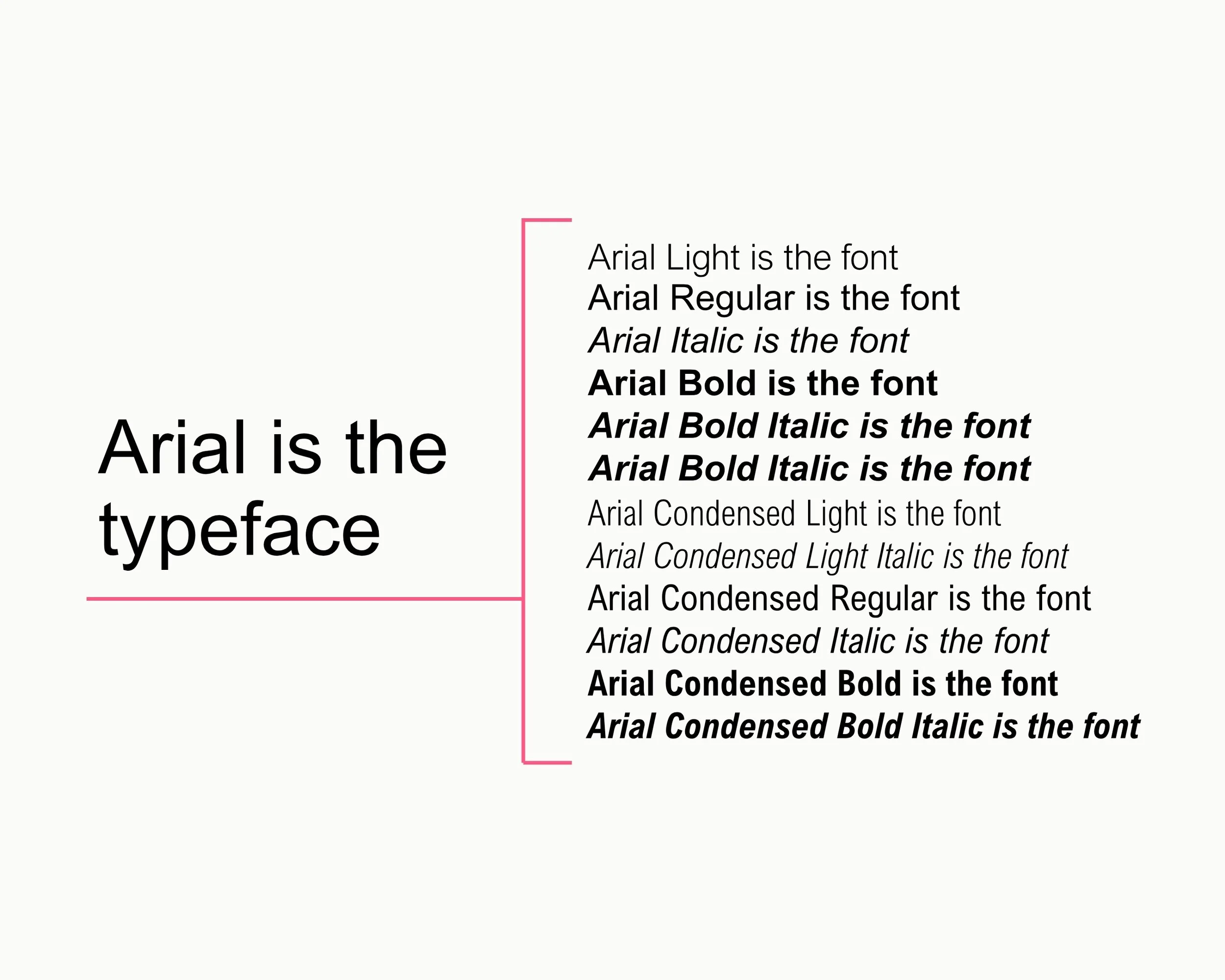
A typeface is a family of letters and characters designed with a unifying character trait. Examples of typefaces include Arial, Times New Roman, and Helvetica.
Wait, isn’t that a font?
Technically, no. While often used interchangeably, a font is different from a typeface. A font a “specific set of distinct, stylized letters" within the typeface family (Gibbons & Fessenden, 2024). An example of a font is Arial Italic Bold.
Types of Typefaces
Serif Typeface
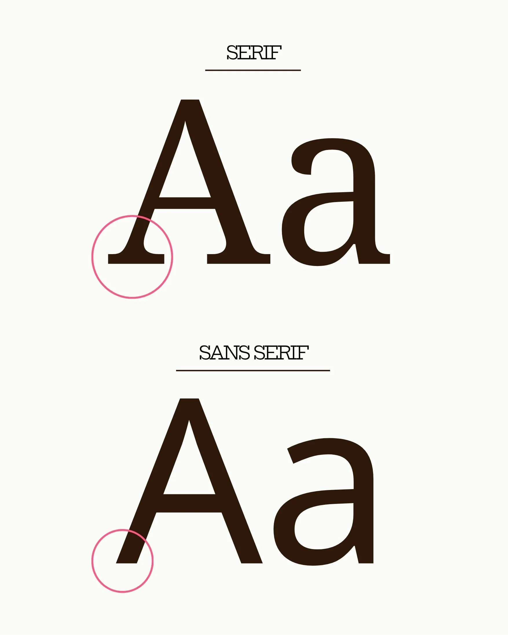
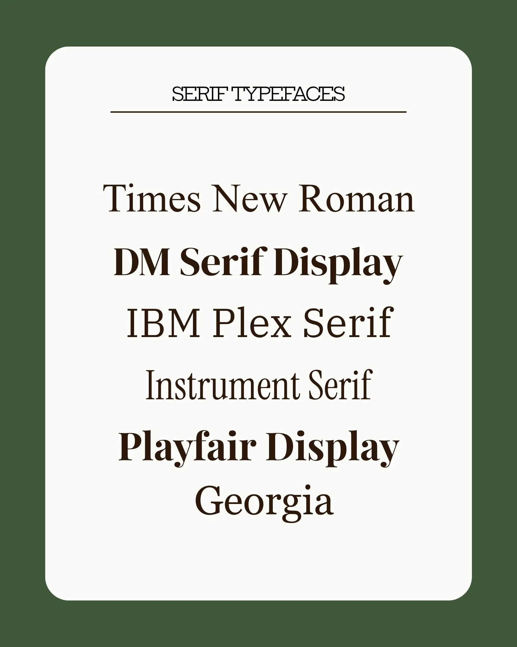
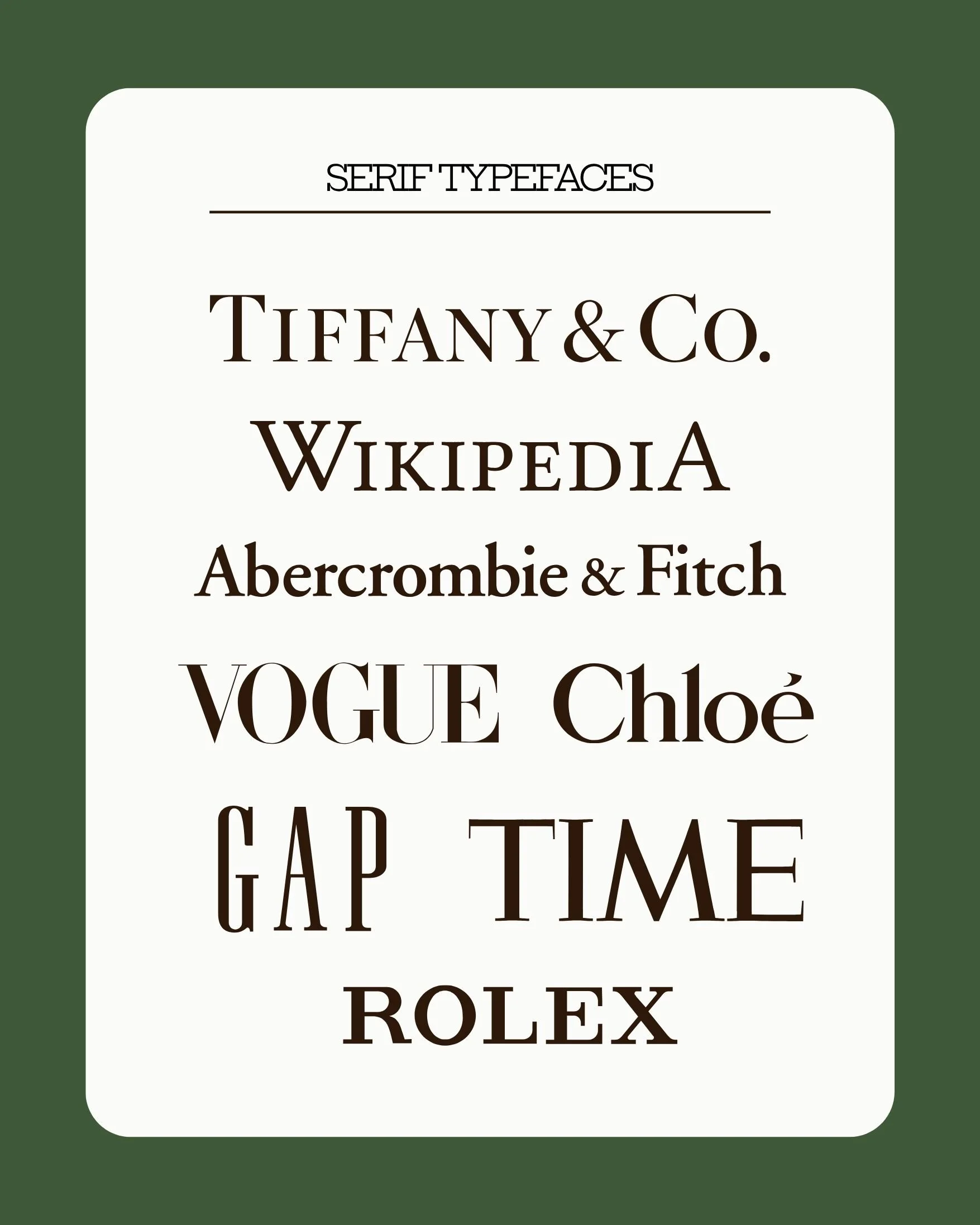
A serif is a small hook-like element that sits at the foot of the downstrokes in some typefaces. Thus, a serif font is one that includes serifs on the ends of each letter. These typefaces have a classic, informative feel. Serif type is frequently used in print media because the serif detail makes letter forms easier to discern at a quick glance. Examples include Times New Roman, Georgia, and Garamond.
Sans Serif Typeface
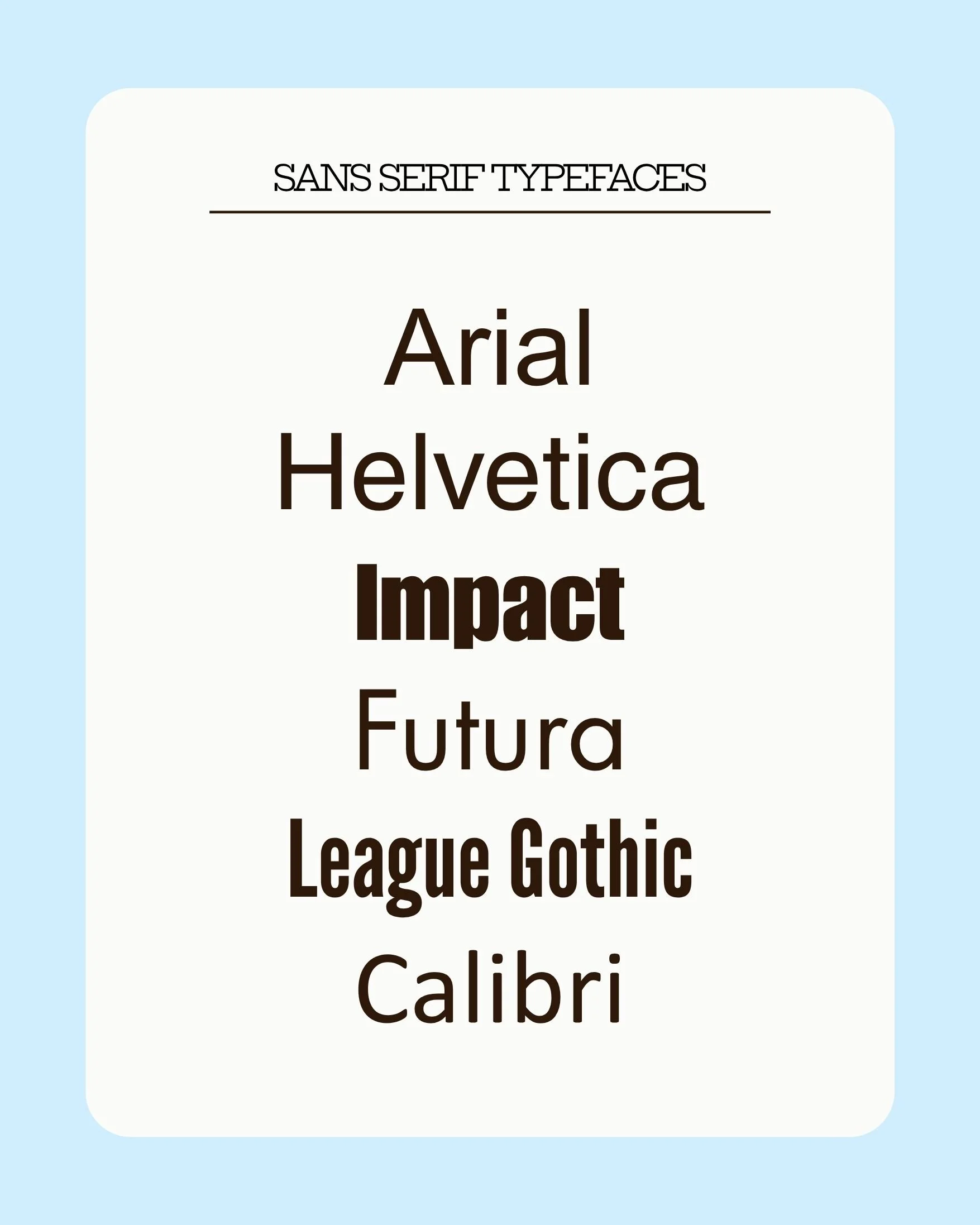
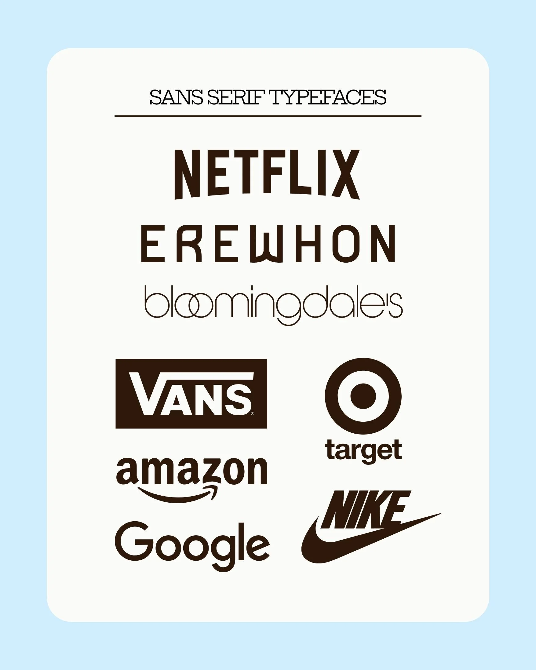
The prefix “sans” means “without.” So, a sans serif typeface is one without serifs on the ends of letters. These typefaces have a clean, modern feel and are frequently used on digital platforms. Examples include Arial, Impact, and Montserrat.
Slab Serif Typeface
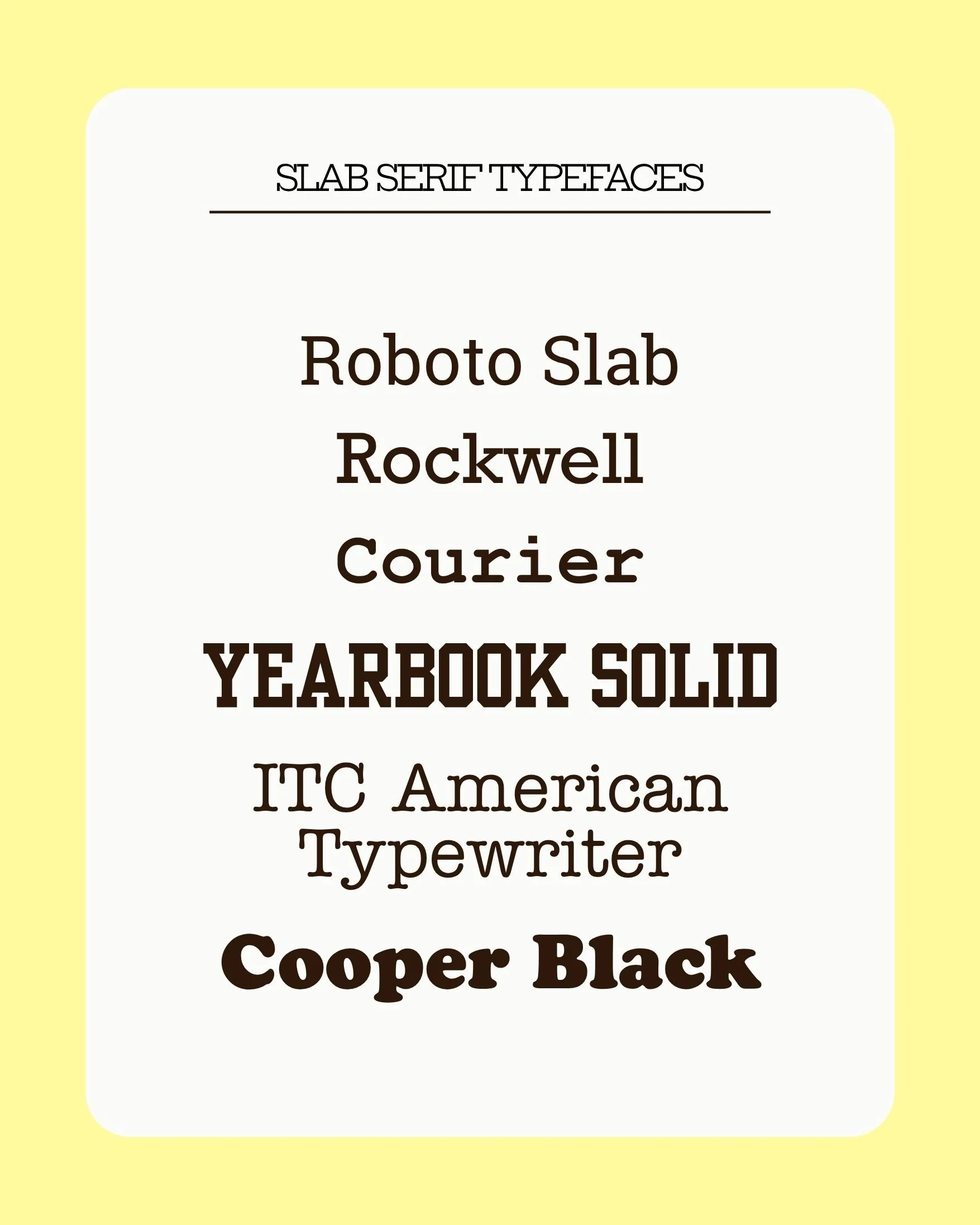
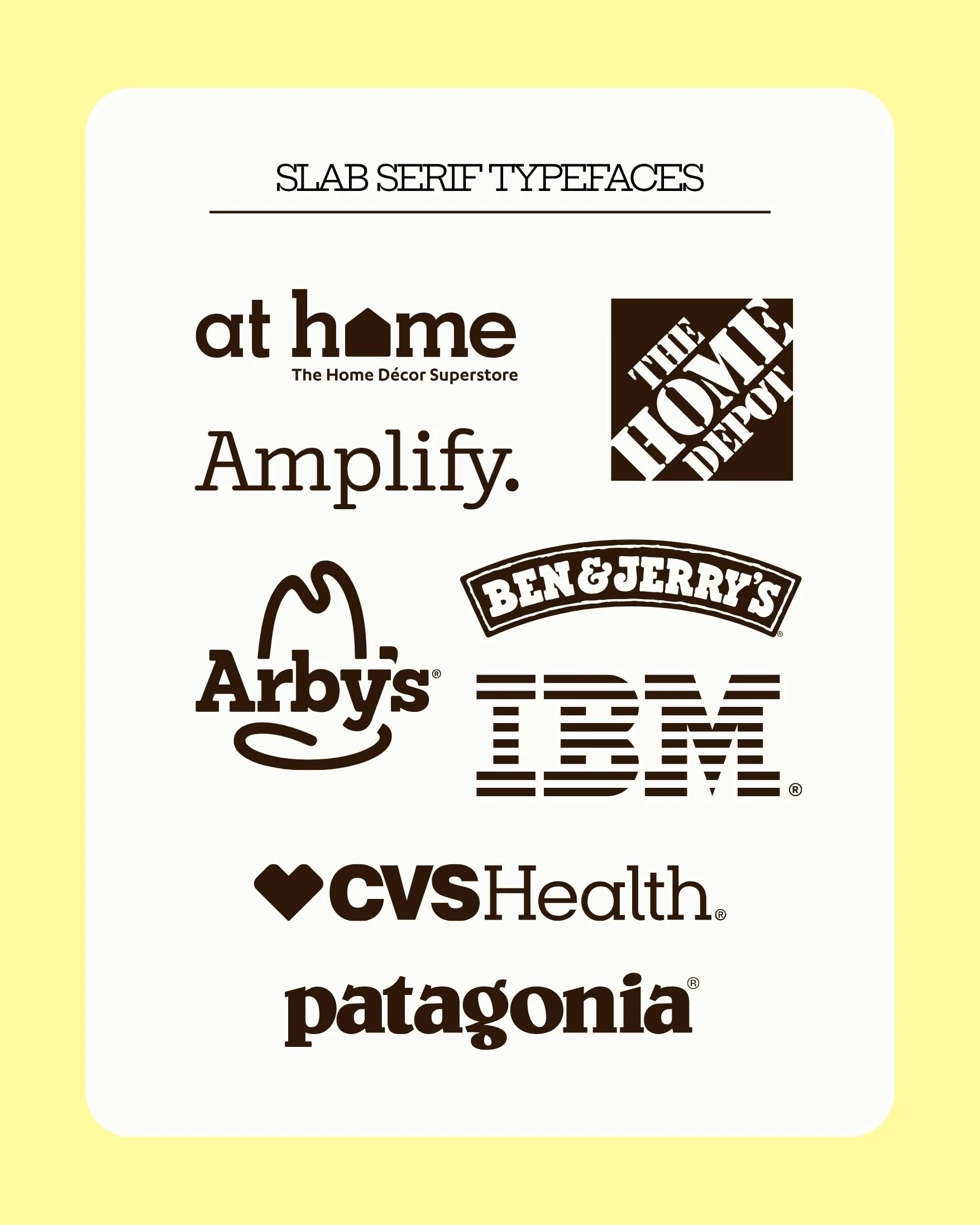
A slab serif typeface has chunky, block-like serifs at the end of each letter. These thick slab serifs originate in early printing, as the wider, flatter serifs were easier to produce with printing blocks. However, they have evolved to include softer variations, too. These typefaces sit in between serif and sans serif typefaces, having the historic authority of a serif typeface and the accessibility of a sans serif typeface. Examples include typewriter fonts, Cooper, and Courier New.
Script Typeface
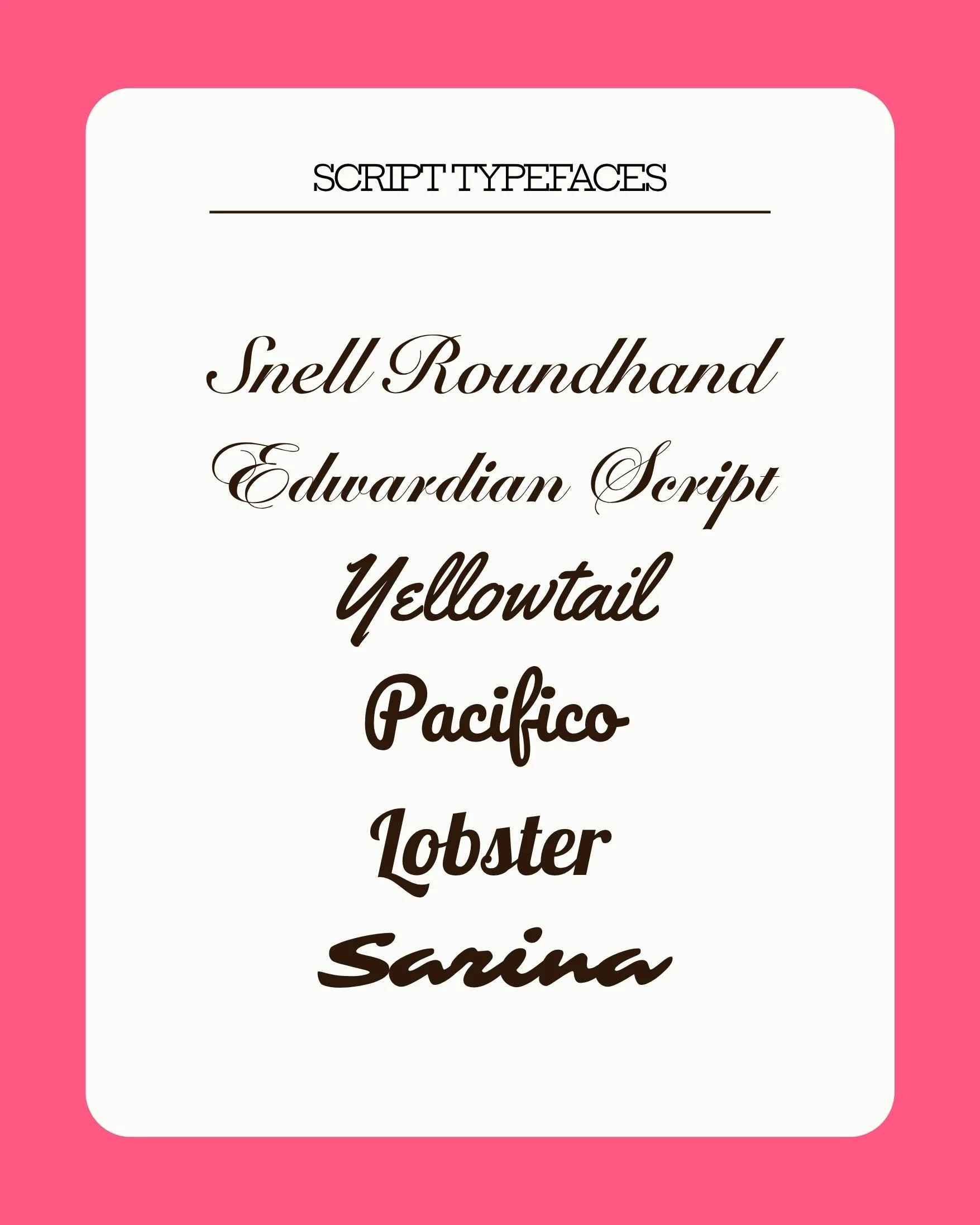
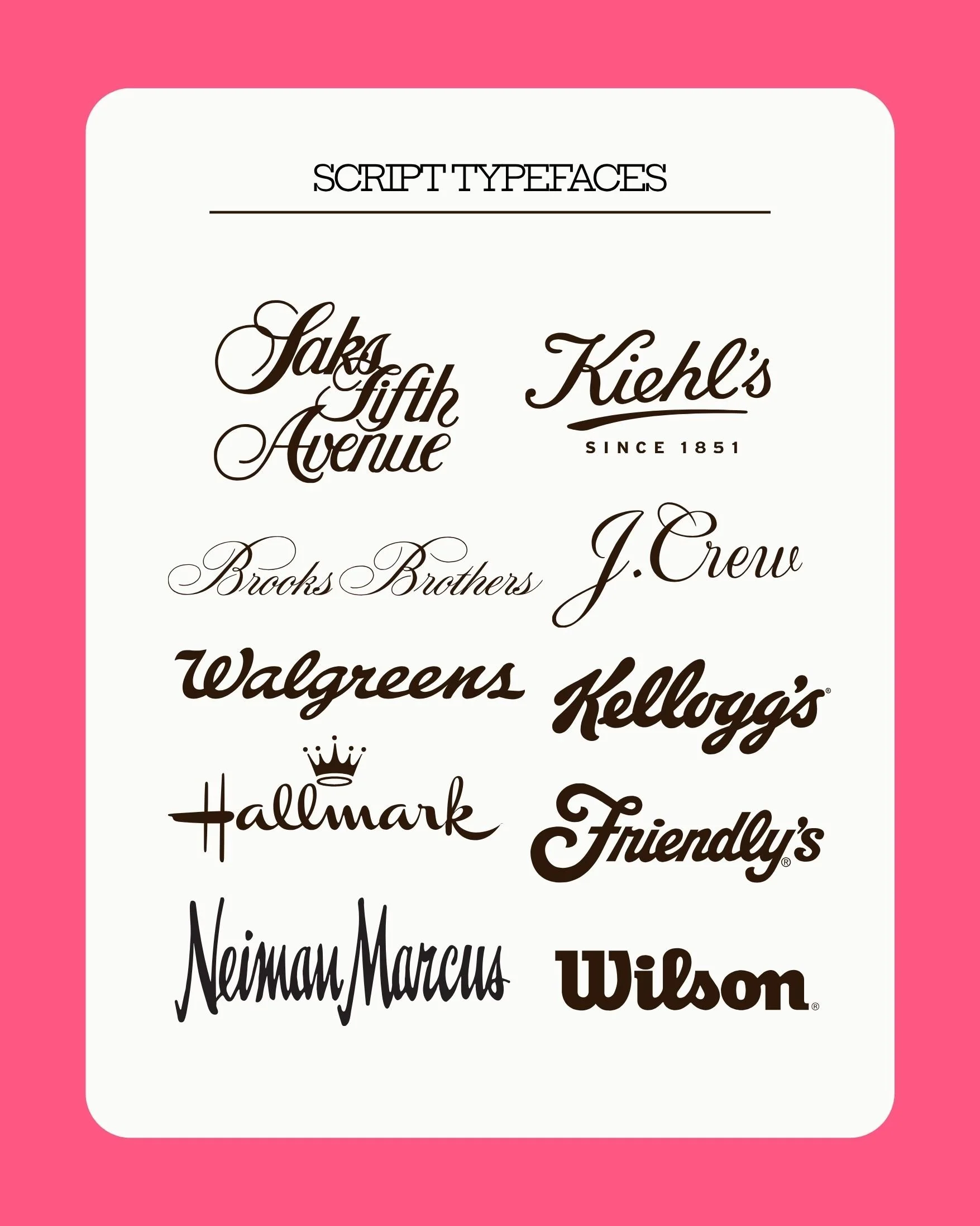
A script typeface is one designed to resemble calligraphy or handwritten cursive. Since they mimic hand-done lettering, script typefaces imply a more personal, custom service. More calligraphy-leaning script typefaces have a luxurious feel, whereas handwritten-leaning script typefaces have a more friendly feel. Examples include Snell Roundhand, Yellowtail, and Lobster.
Black Letter Typeface
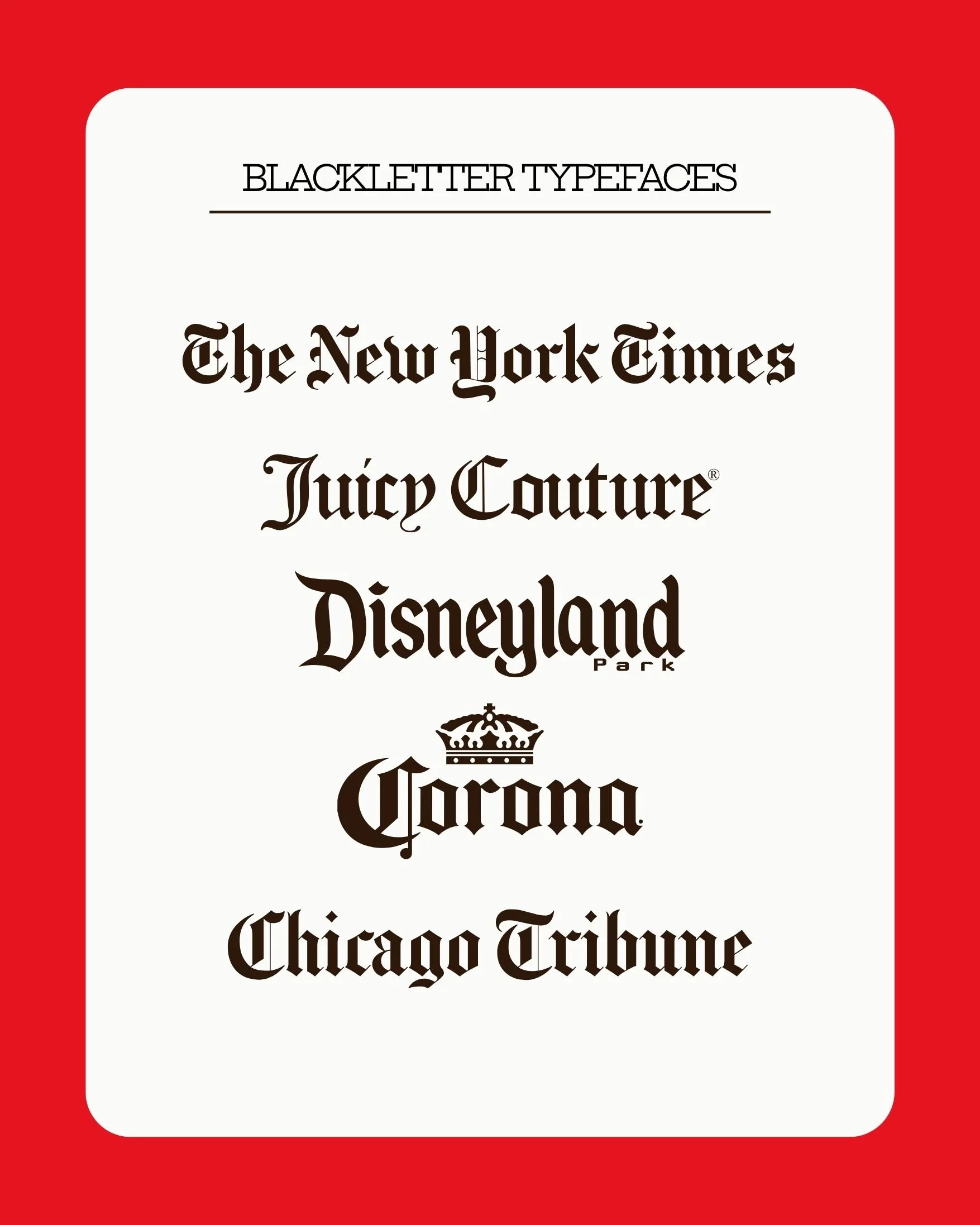
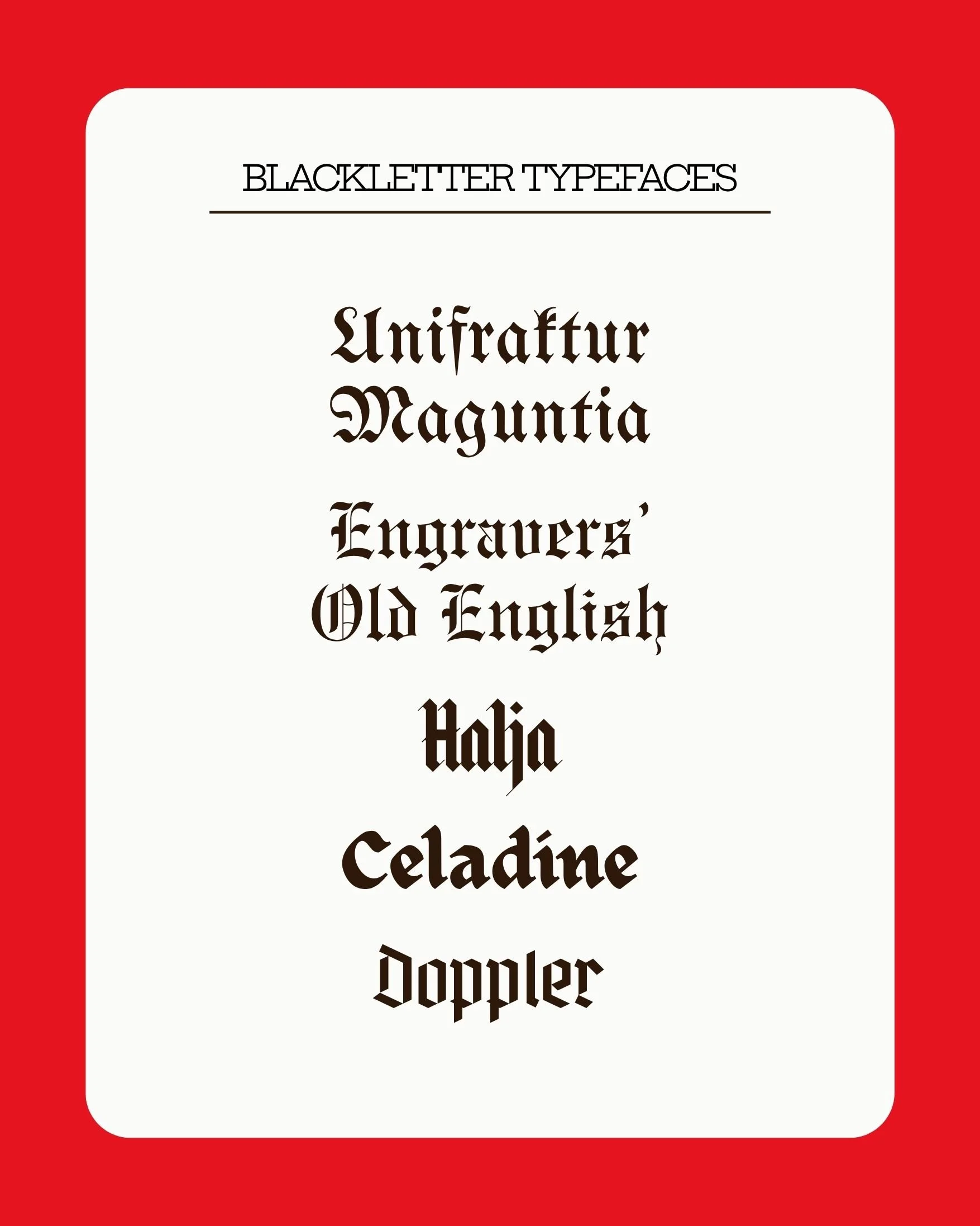
Blackletter typefaces originate from medieval lettering and feature high contrast, sharp lines. These typefaces have a gothic, historic feel.
Typesetting
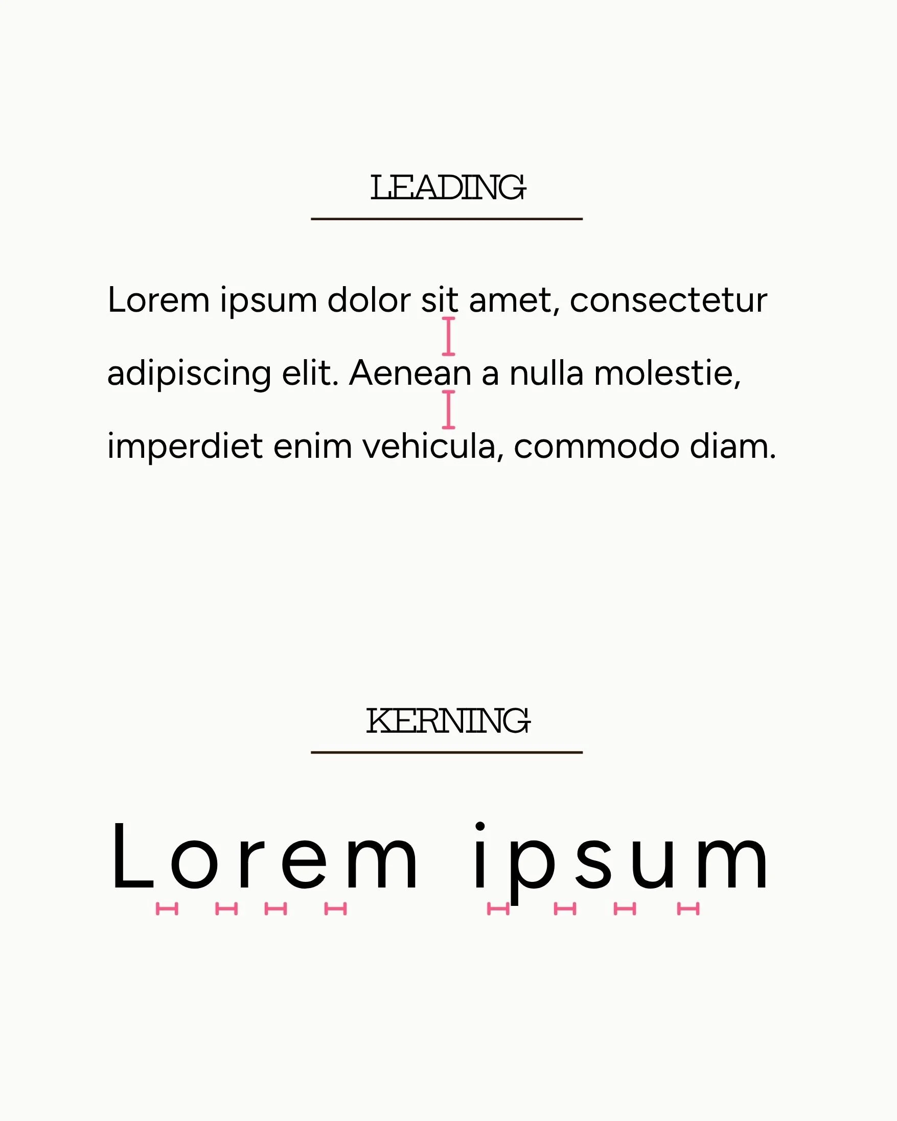
Typesetting refers the arranging of text for legibility, including the sizing and spacing. There are two additional vocabulary terms students should be aware of here: leading and kerning.
Leading, also known as “line height” or “line spacing,” is the vertical space between two lines of text. Common increments include single-spacing and double-spacing, which non-designers may be familiar with from creating a digital document in their past. Kerning is the horizontal space between individual letters in a line of text, or the “breathing room” (Gibbons & Fessenden, 2024).
-
Daniels, E. (2022). Understanding Middle School Teachers’ Efficacy to Support Young Adolescents. Middle Grades Review, 8(3), 1-18.
Gibbons, S. & Fessenden, T. (2024). Typography Terms: Glossary. Nielsen Norman Group. https://www.nngroup.com/articles/typography-terms-ux/.
Krause, R. & Fessenden, T. (2024). Visual Design: Glossary. Nielsen Norman Group. https://www.nngroup.com/articles/visual-design-cheat-sheet/.
NCTE Executive Committee. (2019). “Definition of Literacy in a Digital Age.” National Council of Teachers of English (NCTE). https://ncte.org/statement/nctes-definition-literacy-digital-age/.
Turner, K.H., & Hicks, T. (2022). Digital Literacy (Still) Can’t Wait: Renewing and Reframing the Conversation. English Journal, vol. 112(1), 86-93.
Williams, M. & Barnum, A.J. (2019) “Teaching Social Analysis of Images: A CaseStudy of Indepartmental Visual Literacy Instruction in Sociology from the Fine Arts Library.” Art Documentation: Journal of the Art Libraries Society of North America, vol. 38 (fall 2019). 324-337.