
Introduction to Web Design for Middle School Students
This lesson is a part of a media literacy Project Based Learning (PBL) Unit for middle school students. Through a series of 10 lessons on the elements of art, user research, branding, UX design, and project management, students will collaboratively design a new website for their school.
In this lesson, students will learn about the parts of a website and how UX designers put them together to create a functional product.
Why does this matter?
Children now receive information from media all around them — television, movies, social media, advertising, music, and more. Therefore, literacy instruction must expand beyond the traditional written word to reflect the myriad of sources we receive information in contemporary society. In 2019, the NCTE created a new definition of “literacy in a digital age,” arguing that “active, successful participants in a global society” must be able to:
“Explore and engage critically, thoughtfully, and across a wide variety of inclusive texts and tools/modalities” (NCTE, 2019)
“Consume, curate, and create actively across contexts” (NCTE, 2019)
“Advocate for equitable access to and accessibility of texts, tools, and information” (NCTE, 2019)
To accomplish this, students need opportunities to practice using these new technologies. Despite being known as “digital natives,” today’s youth lack critical visual literacy and technological skills to understand these new forms of communication (Williams and Barnum, 2019). In recent years, digital literacy researchers have affirmed “simply having access to technology is not enough; digital literacy skills must be taught explicitly” (Turner & Hicks, 2022). Modern educators cannot take our digital environment for granted and must make a concerted effort to teach today’s youth how to use these tools effectively and responsibly.
This unit was designed to provide middle grade students with the opportunity for students to reflect on their school culture and how they can make an impact, all while learning a new art form: graphic and web design. Child psychology indicates “adolescents crave opportunities to apply their increasing critical thinking abilities to tasks that are personally relevant and/or societally meaningful, and their brains are primed to learn complex tasks and to engage in new experiences” (Daniels, 2022). It is my hope that this unit can fulfill these needs by providing the following platforms for critical thinking and expression.
Learning Activities
Students will learn about the parts of a website, using The Met Museum website as a reference.
Students will learn about the field of UX and how UX designers use the building blocks of web design to tell a story.
Students will analyze the homepages of various websites and re-create the wireframes on paper.
The Building Blocks of a Webpage
Most websites are made of basic content blocks called modules arranged in a particular order to tell a story. Using the Met Museum website as a reference, let’s define these modules and their uses.
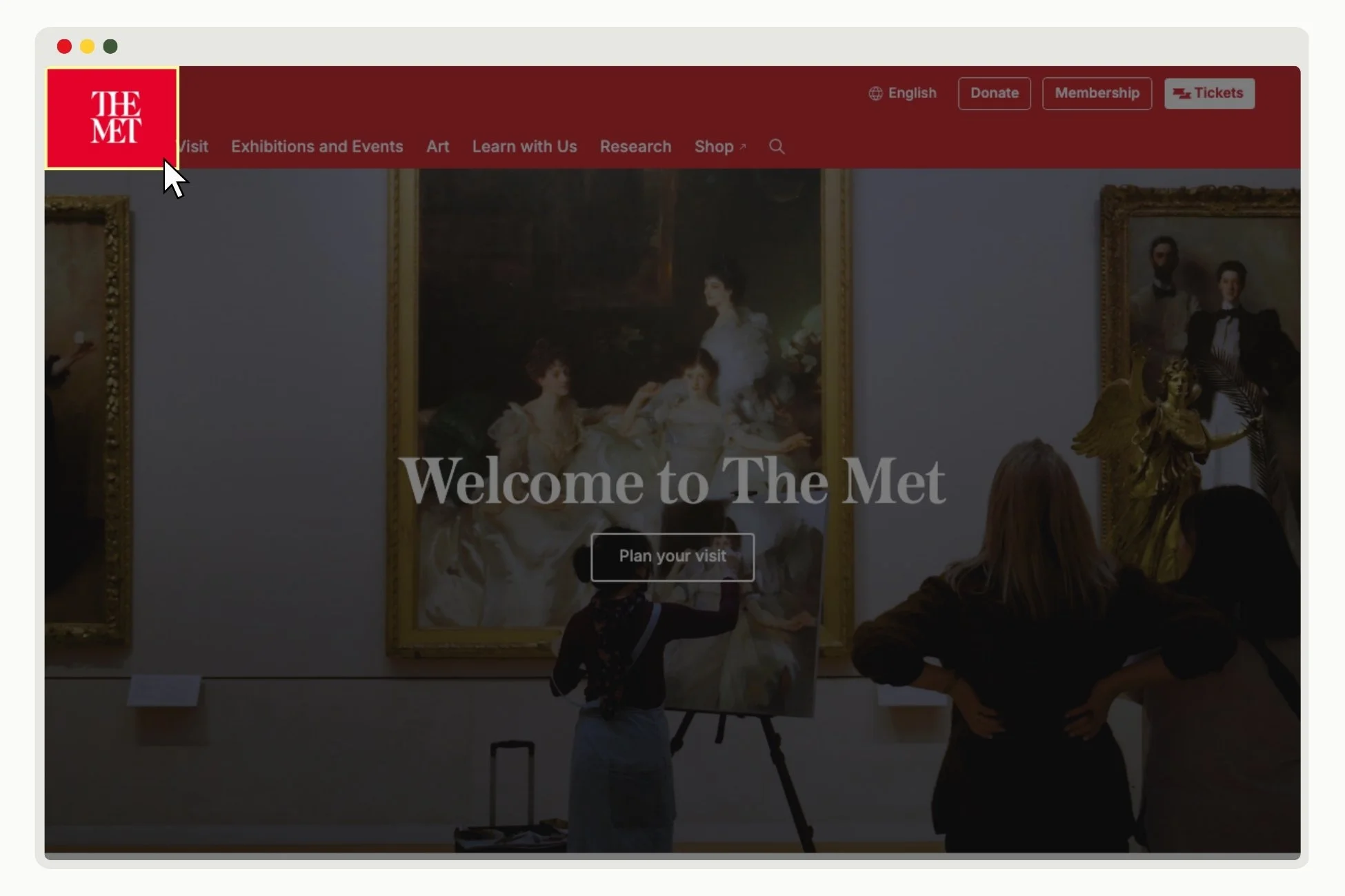
SITE LOGO
A logo is a visual symbol that captures a brand’s identity.
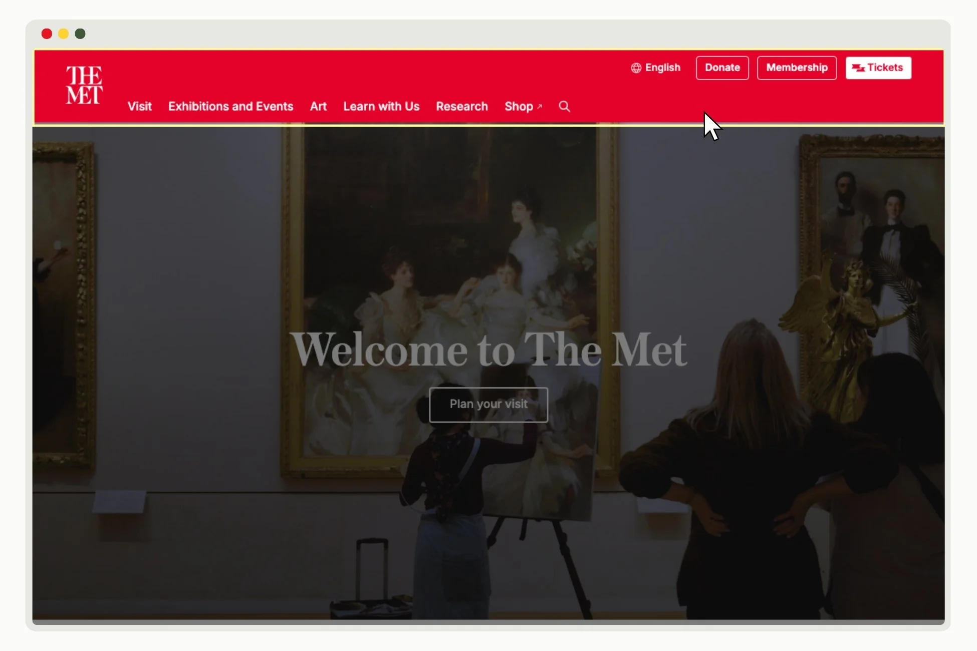
HEADER
The header is the uppermost part of a website. It’s often the first thing that visitors see when they enter a site and almost always contains the brand’s logo and the website menu.
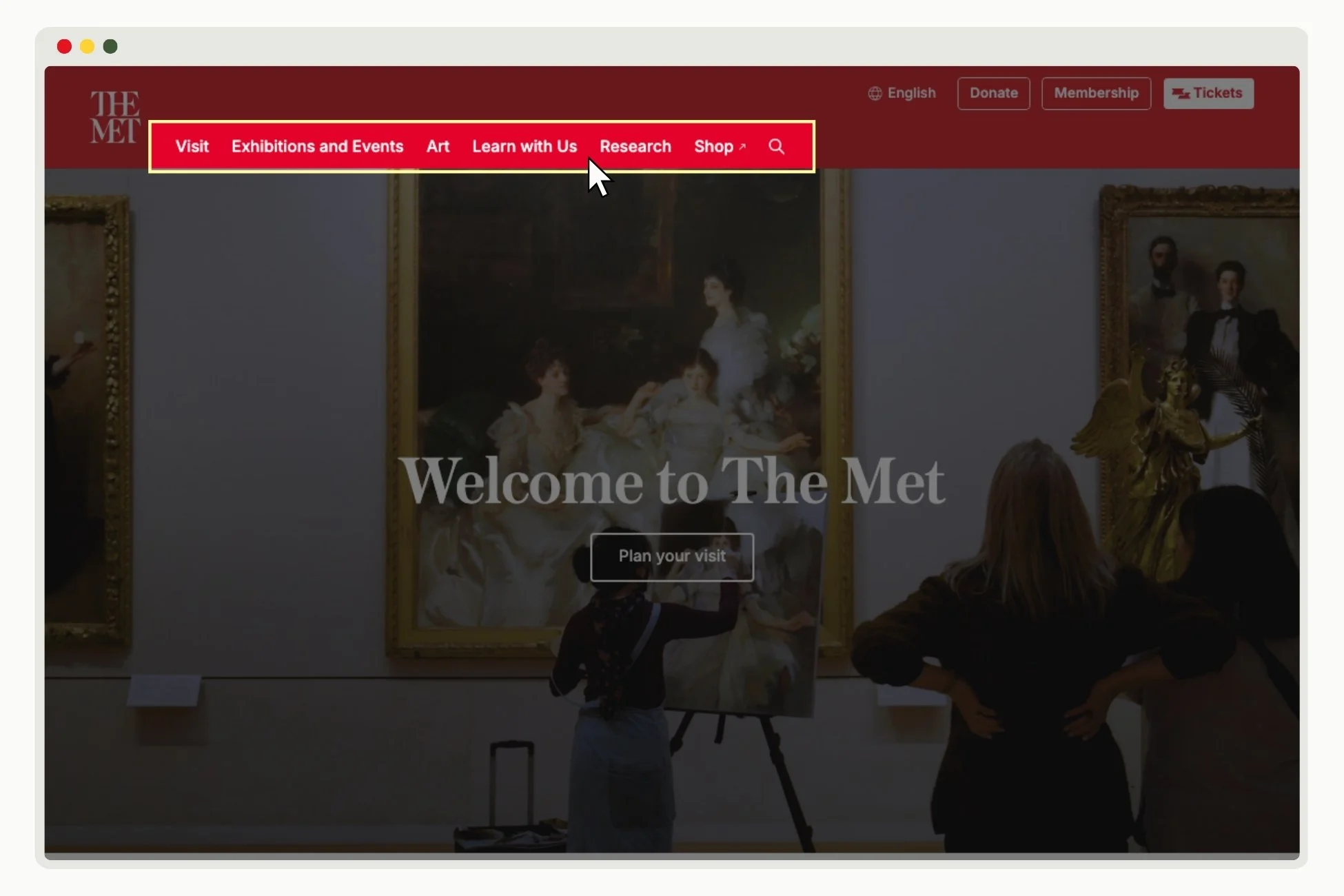
NAVIGATION
Website navigation refers to the link structure and hierarchy of a website. Its purpose is to guide users to where they want to go in as few steps as possible.
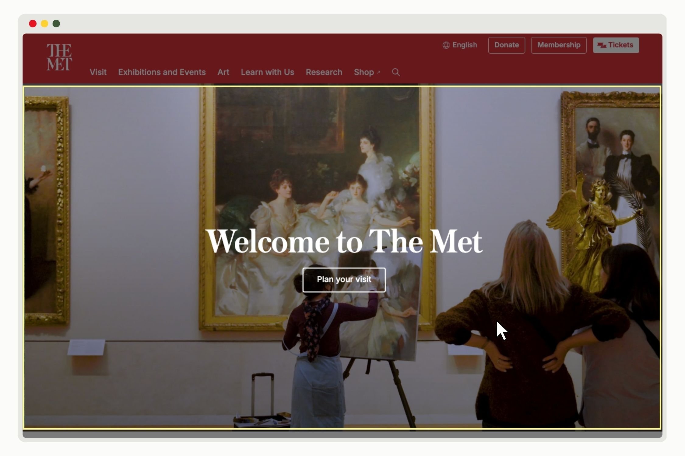
HERO SECTION
The Hero Section is the first area that immediately shows up on the screen under the website header. Usually, this section will have an eye-grabbing image, headline, and call-to-action promoting the organization’s main offering.
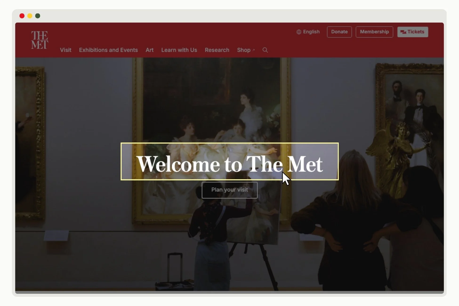
HEADLINE
A headline is the words set at the head of a passage or page to introduce or categorize the content.
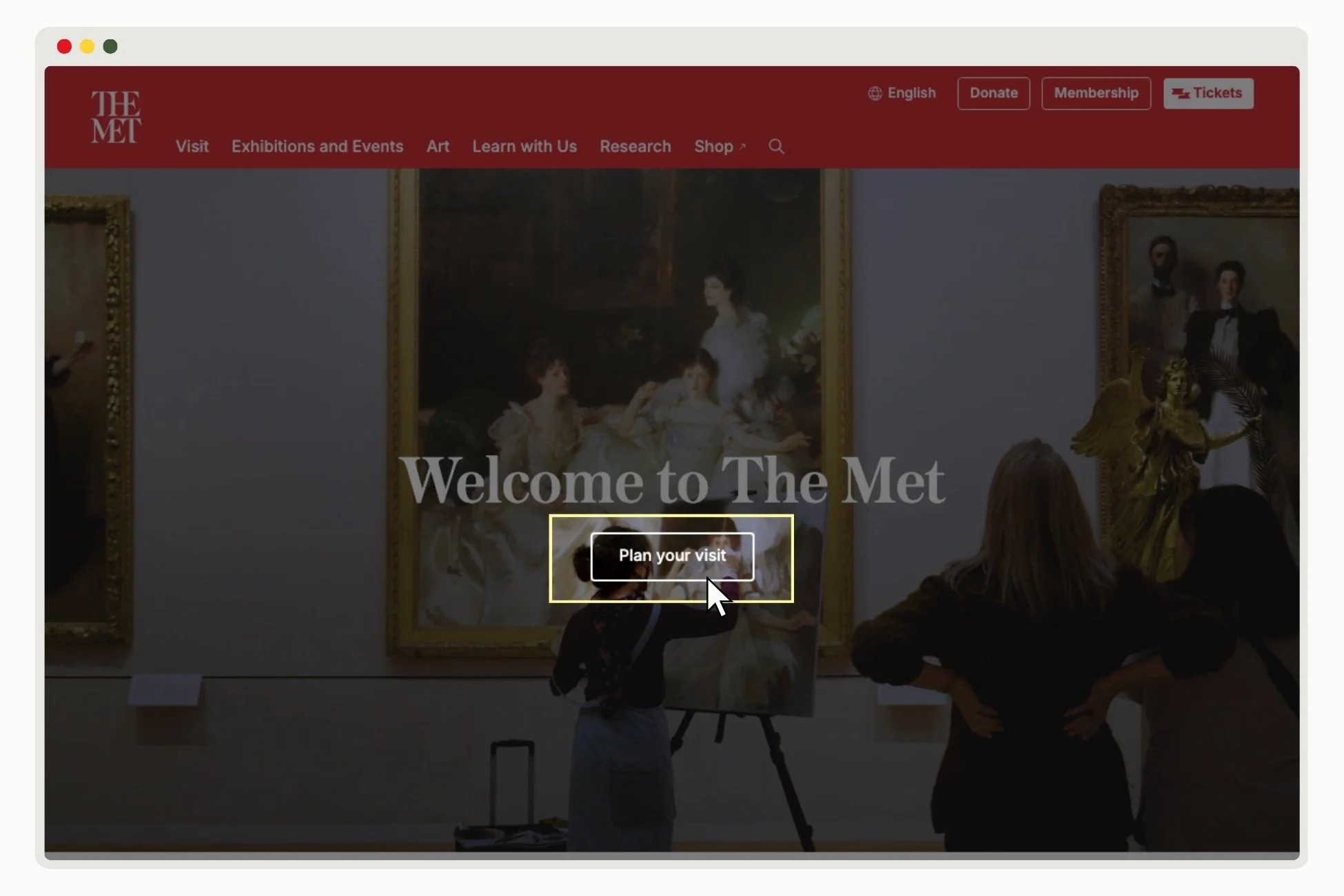
CALL TO ACTION
A Call to Action, or CTA, is a short piece of text that helps customers take the next step with your business and move down your sales funnel. CTAs are typically displayed on buttons and contain actionable words like “Start now” or “Buy yours”. This type of text directs users to take a specific action and tells them exactly what to expect when they click on a button.
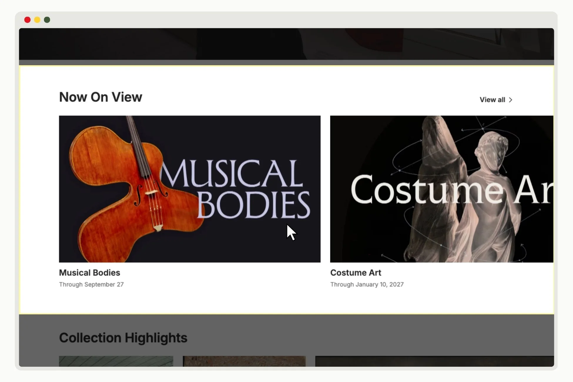
CAROUSEL
A carousel is a slideshow of content. Since users have to scroll sideways to view content, carousels are an efficient way to convey a lot of information without taking up too much vertical space on the page.
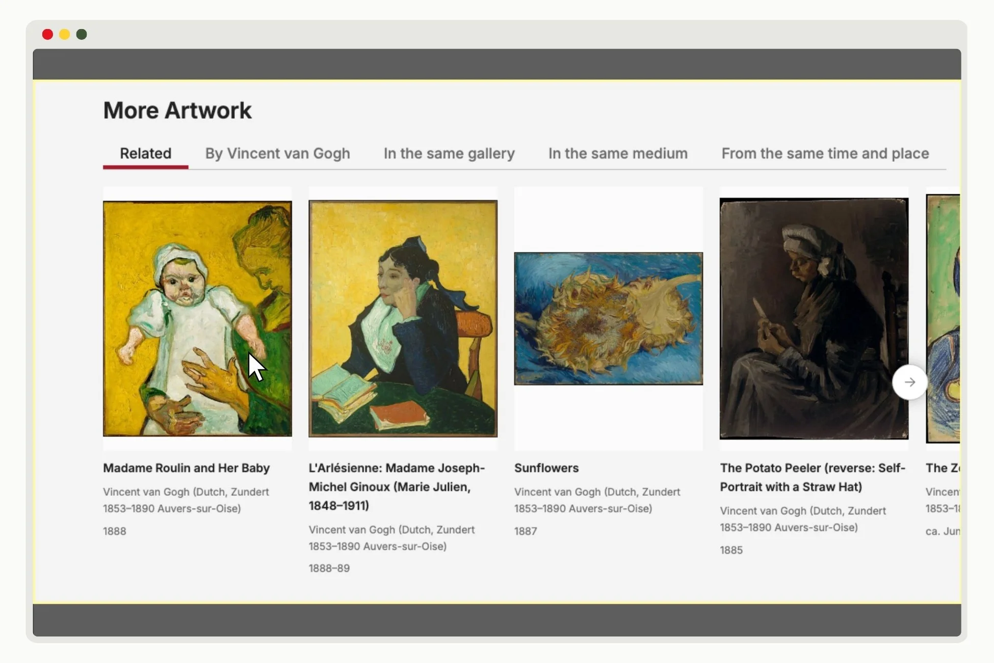
GALLERY
A gallery is a collection of images.
ACCORDION MENU
An accordion menu presents information using drop-down folders to users to open and read. Accordion menus are an efficient way to convey a lot of information without taking up too much vertical space on the page.
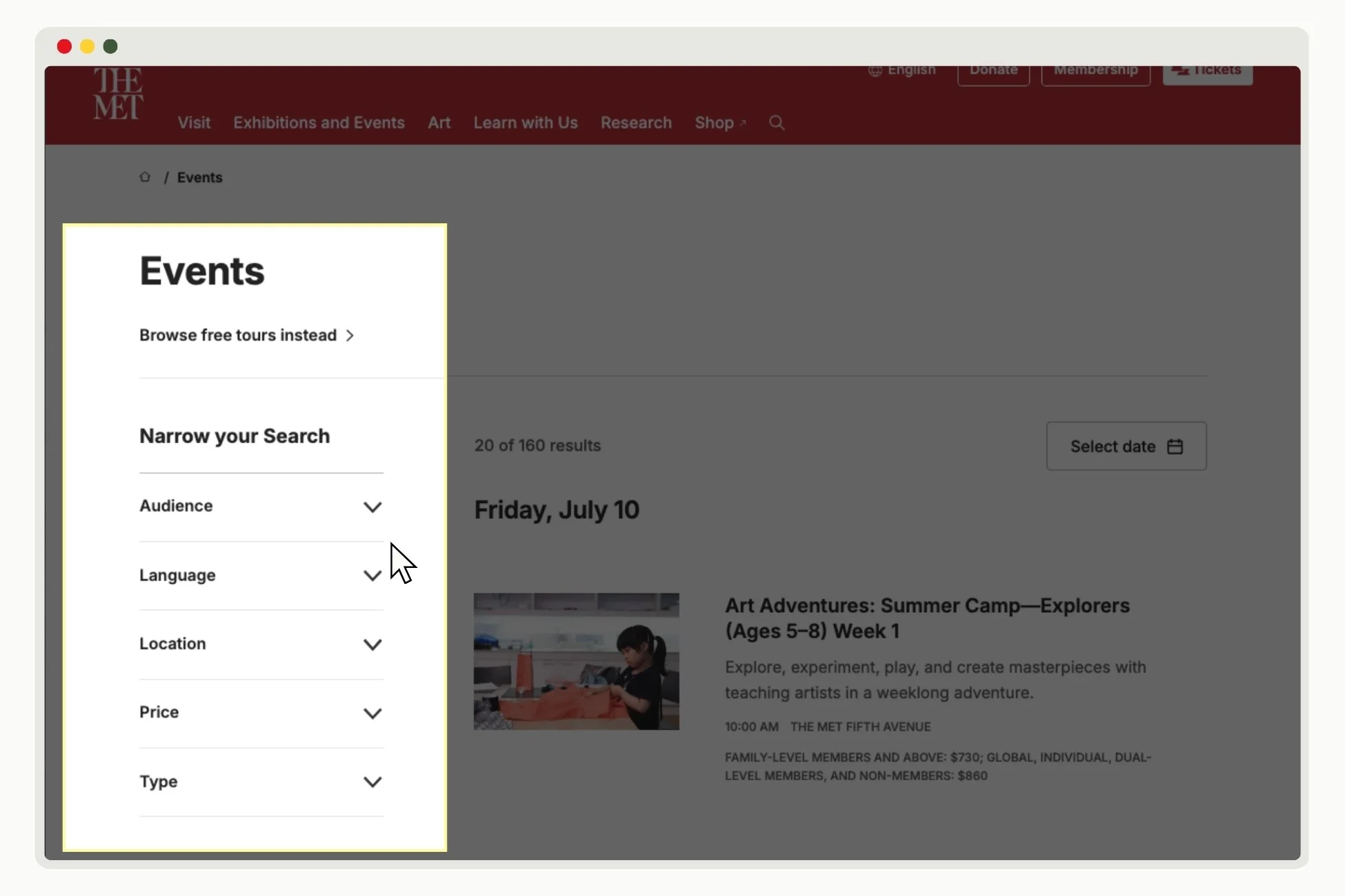
SIDEBAR
Sidebars are a secondary form of website navigation that are positioned on the left or right hand side of a page. Sidebars are typically used to categorize content, such as articles or blog posts.
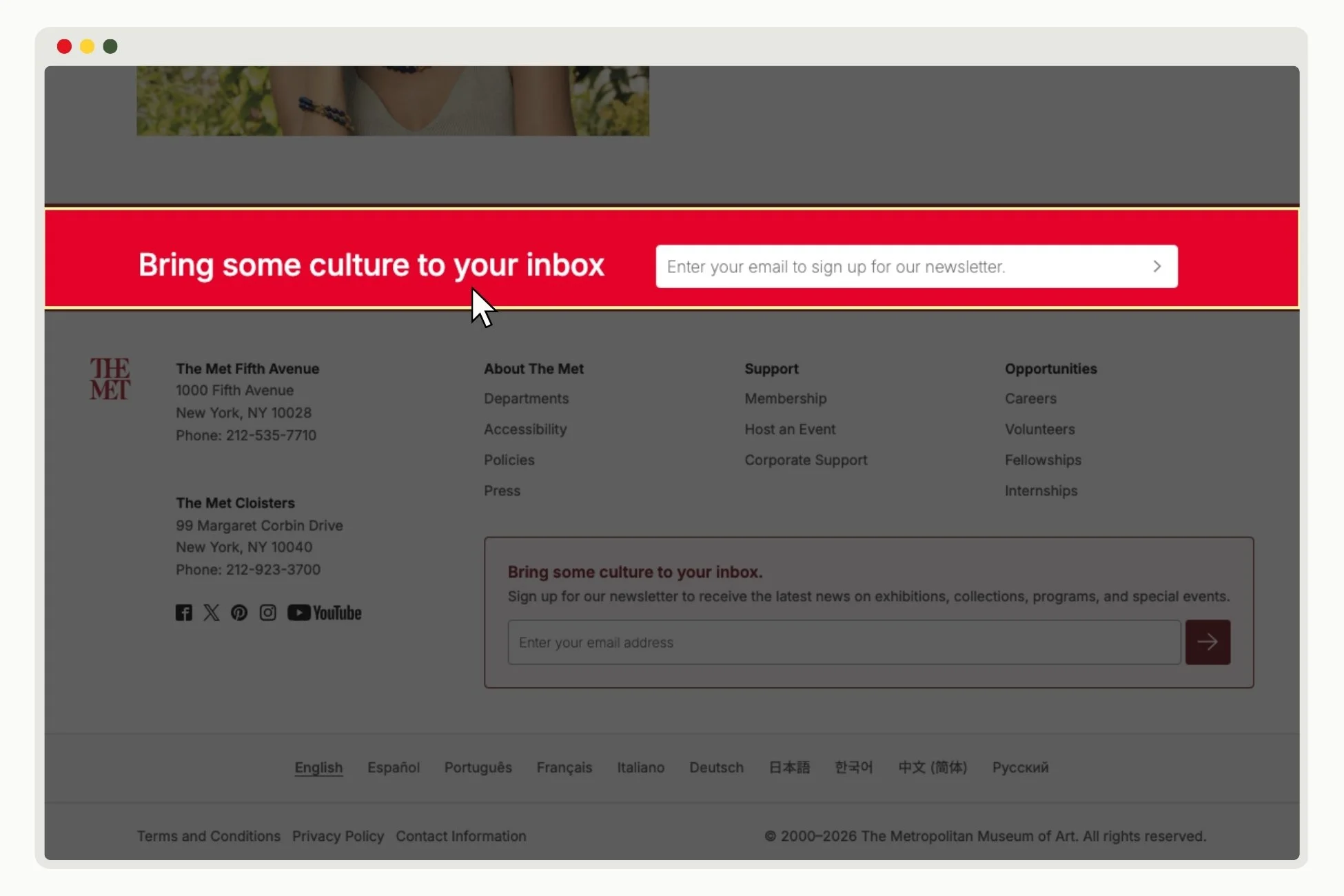
BANNER
A banner is a narrow content block typically used to convey important news, updates, or items that need immediate attention.
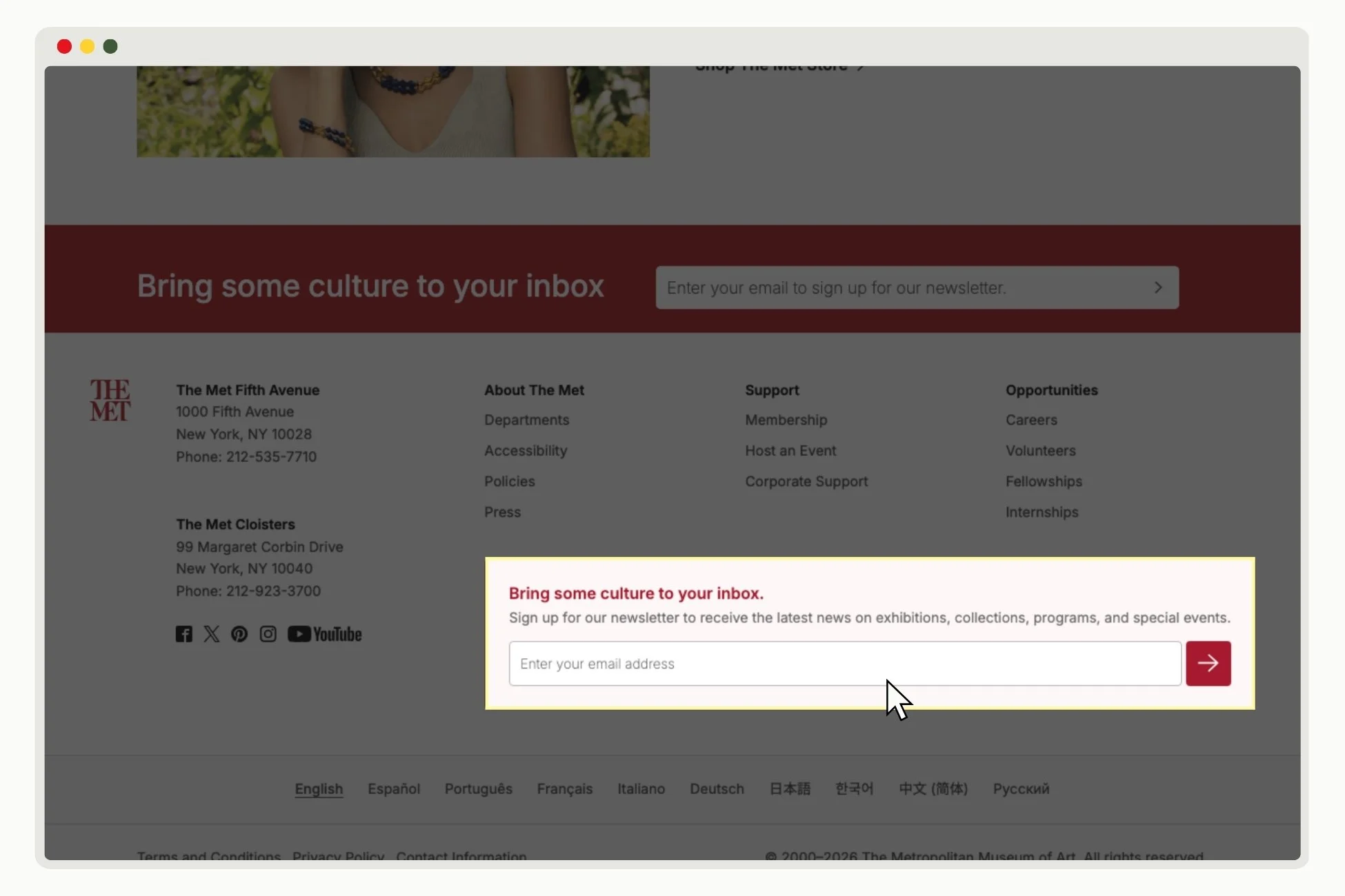
FORM
A form is a module that collects information from the user, like a newsletter sign-up box or a client intake page.
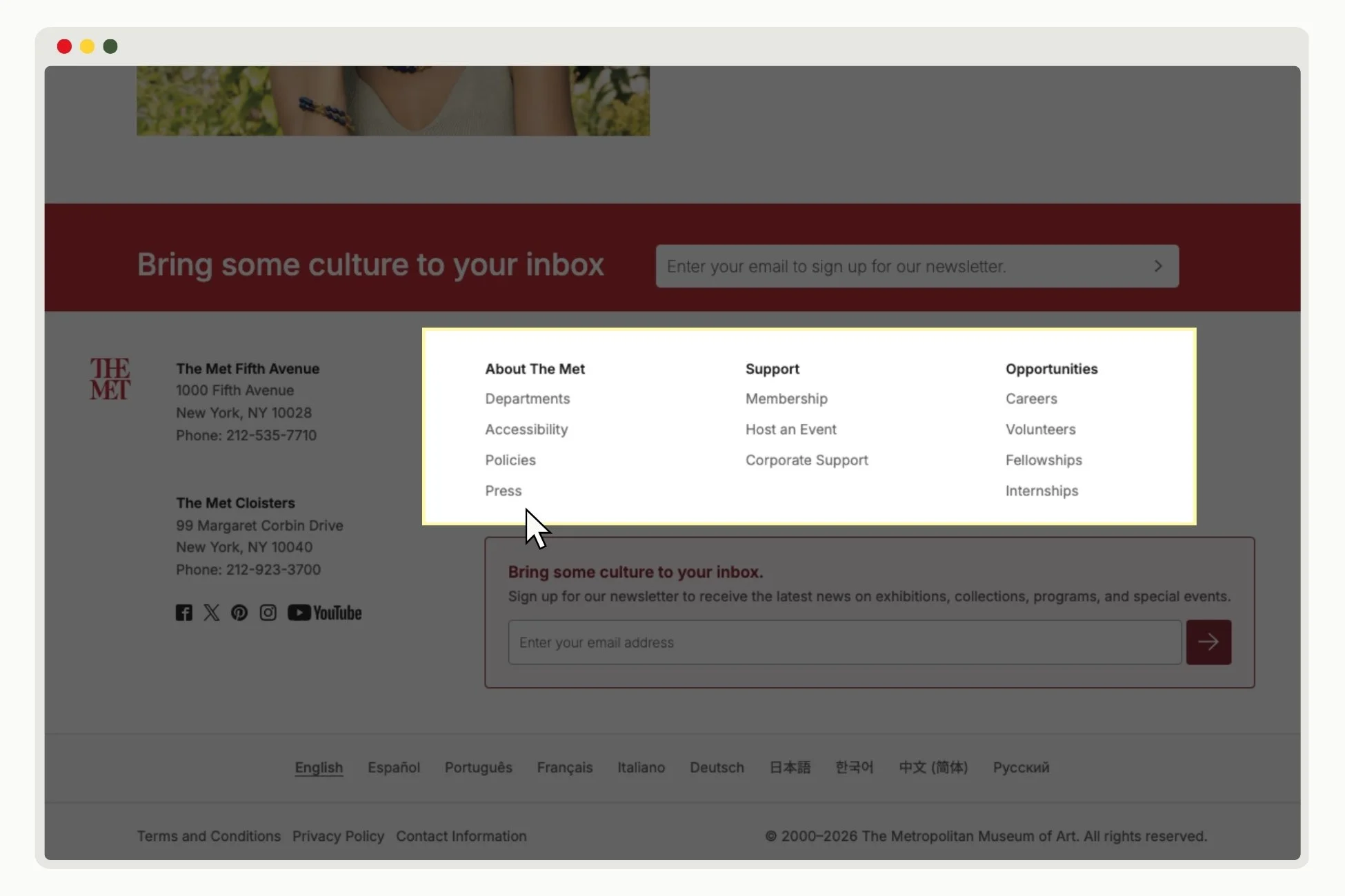
INDEX
An index is a list or directory of links to make navigation easier.
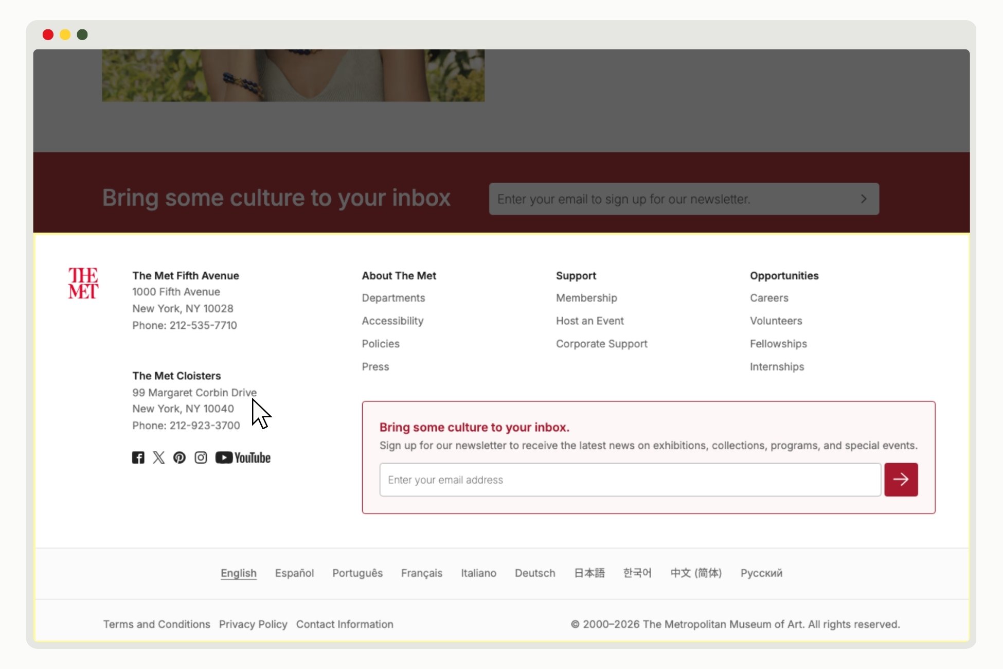
FOOTER
A footer is the bottom most part of any site that usually contains a sitemap with hyperlinks to the pages available on the website and contact information about the brand.
Web designers strategically select and order these elements to convey information clearly and keep users’ attention. This process is called User Experience (UX) design, and those who specialize in the field are called UX Designers.
UX Designers first plan the layout of a website using a wireframe. A wireframe is a simplified skeleton sketch of how the website will function, before any of the aesthetic choices are made. The way UX designers organize these building blocks matters. User experience is a journey — the way these elements are placed tell users what to do next. Much like structuring an essay, you want to make sure the order of information makes sense and convince the user to take action.
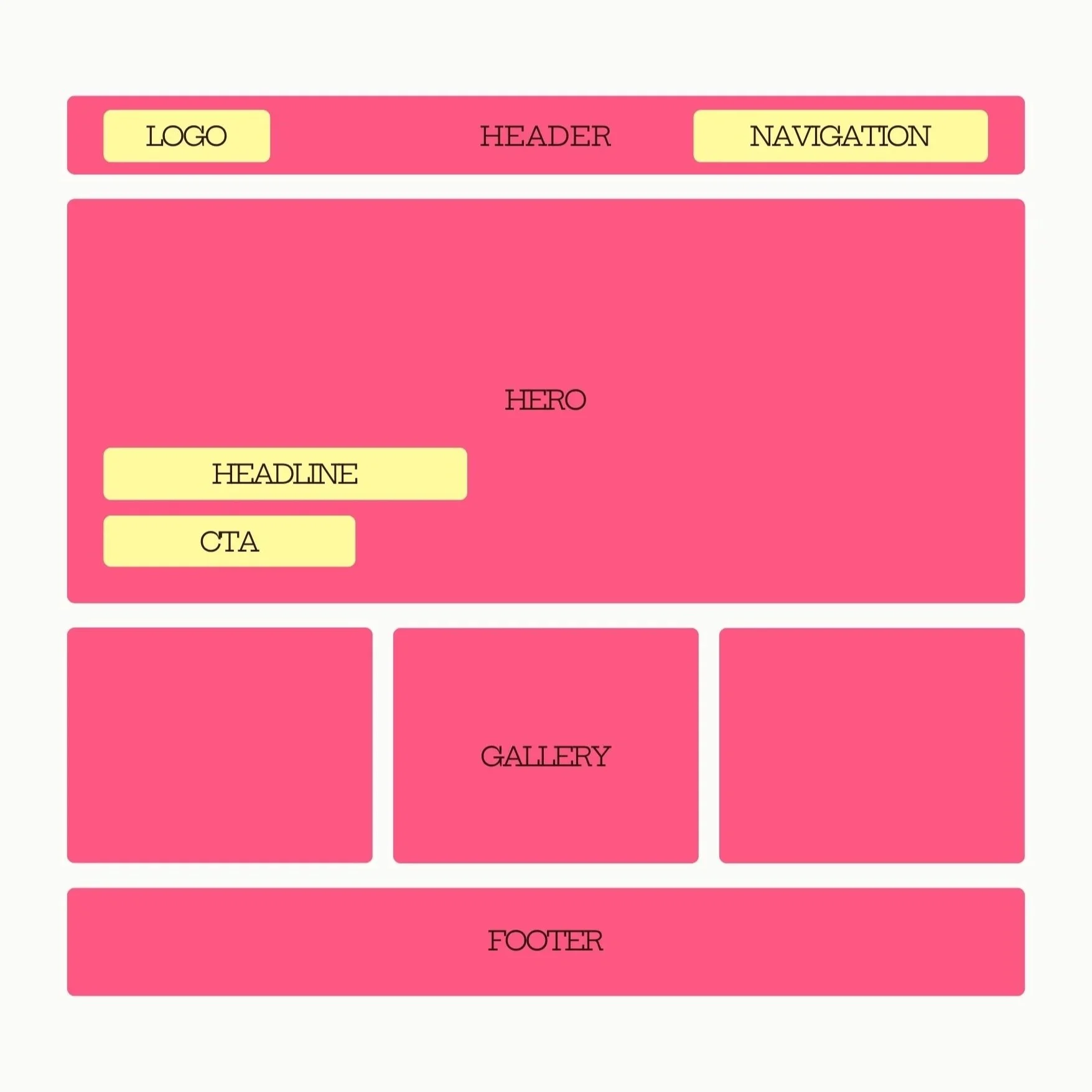
A well-structured wireframe
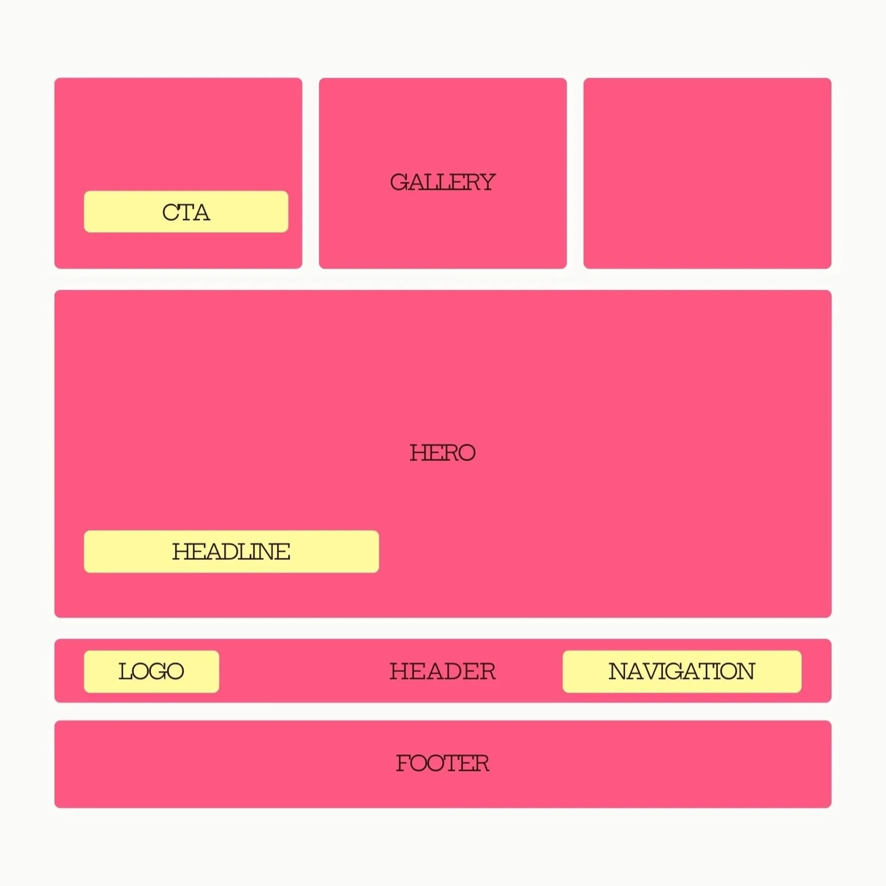
A poorly structured wireframe
Types of Web Pages
There are three main types of web pages students should know.
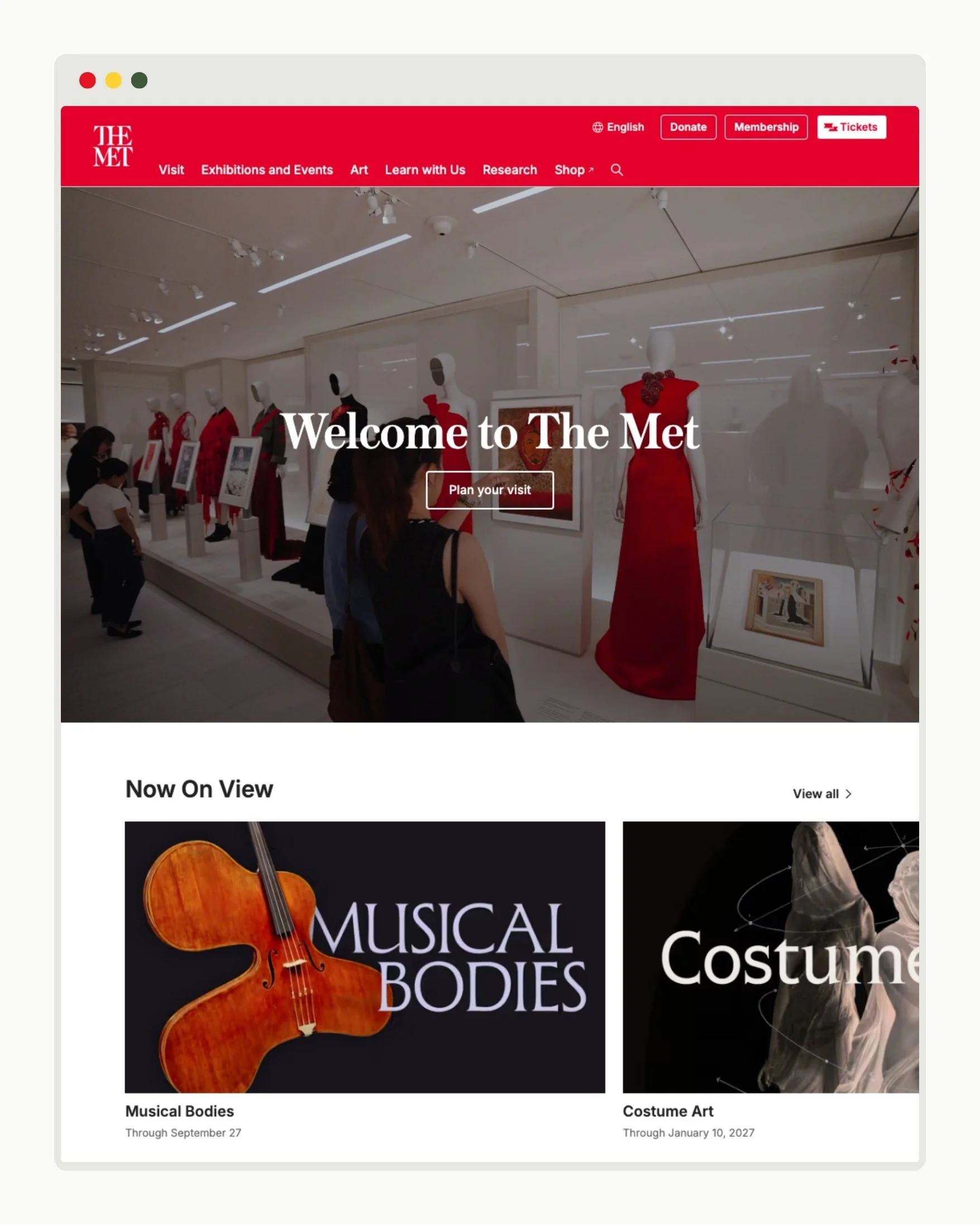
HOMEPAGE
The homepage is the “front lobby” of a website. A homepage introduces a brand and its goals, and should entice a user to get involved.
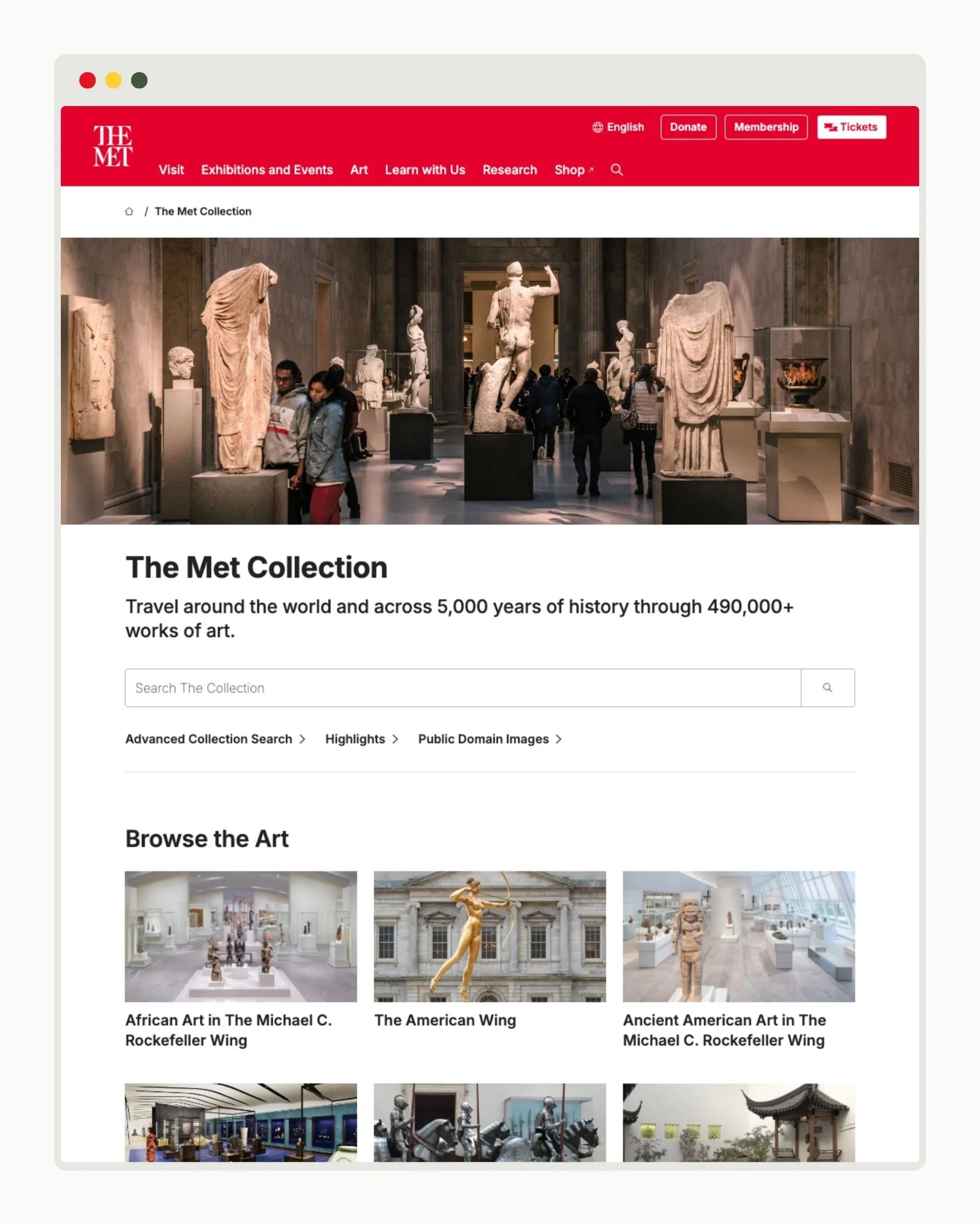
TRANSITION PAGE
Transition pages are like hallways: they offer doorways for users to explore more. Examples of common transition page styles include website indexes, search pages, and product category pages. These pages guide users toward primary content destinations through navigation and brief overviews.
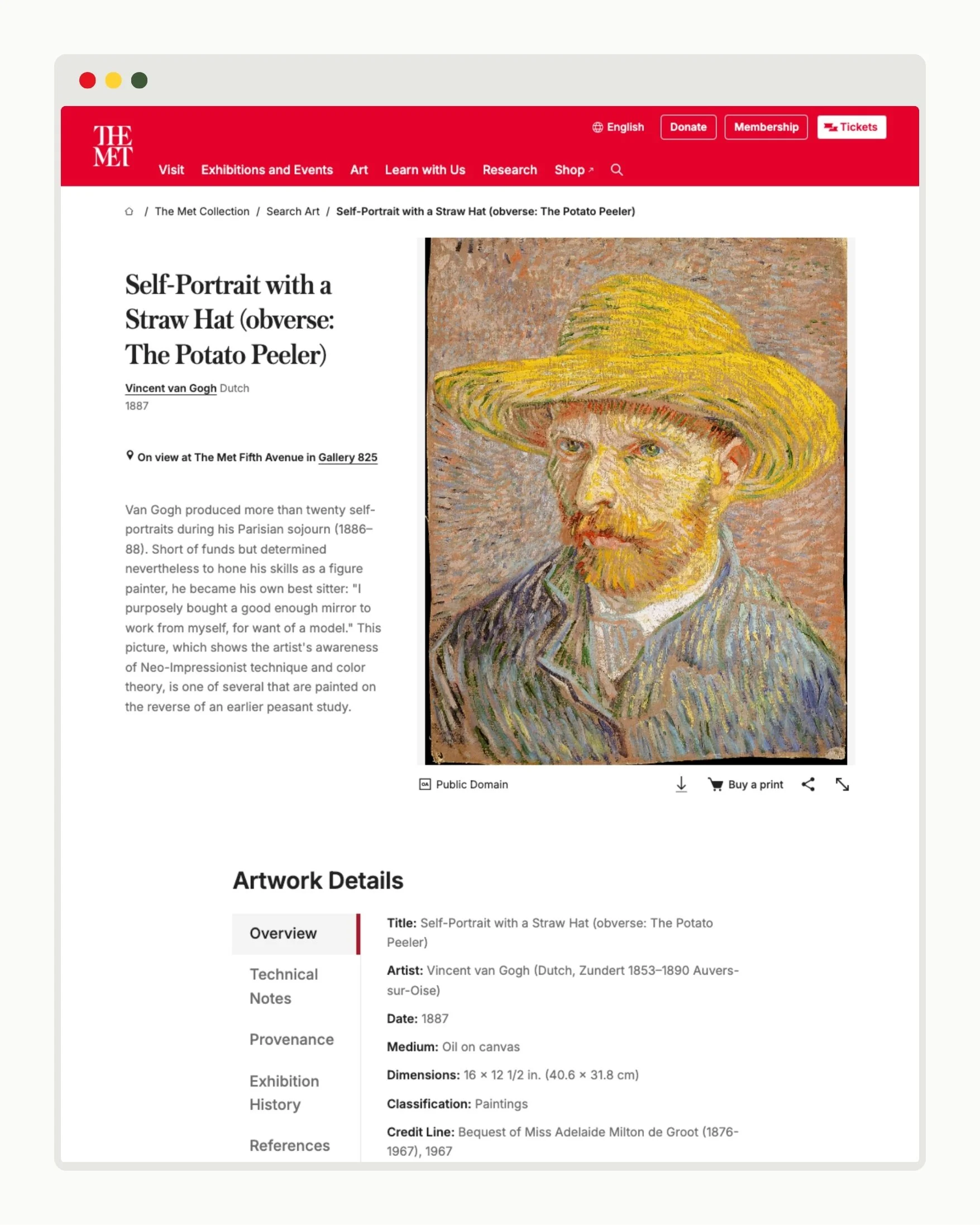
DESTINATION PAGE
Destination pages are the “rooms” of a website. These are the main content pages of a website that fulfill users' needs through more detailed information. Examples include online article pages, blog posts, product listings, and about us pages.
Learning Exercise
As a class, analyze the structure of your school’s website homepage. The objective of this activity is to understand the different ways web designers organize content blocks to create a user journey. Together, create a sketch of your homepage’s wireframe. The NielsenNorman Group has a great resource for how to create a wireframe with minimal artistic skills, or print out my wireframe template PDF and cut out the building blocks to arrange.
Then, discuss the journey the UX designer wants users to take when they visit the website, and how moving the homepage elements would affect the experience. Keep the focus on the structure of the website, not the aesthetic choices. Consider the following conversation starters:
What information do we learn as we progress down the page?
What is the user experience journey?
What next steps does this homepage want us to take?
What building blocks does this page use?
Does the order of the building blocks make sense? Is information presented in a logical order?
Is the homepage easy to navigate? Why or why not?
What would you add to this page, and why? What effect would it have on the user experience?
Does the webpage make you want to explore more? Why or why not?
Next, divide students into small groups and assign each a website homepage to assess and re-create on paper. Ask students to discuss the blocks the UX designer employed to construct their webpage and how it affects the overall user journey. Then, have each group present their website wireframe to the class and the key takeaways from their discussions. I’ve selected the following six websites across food, education, and entertainment industries for students to analyze, though you may wish to substitute with sites that better speak to your classroom:
The Getty – https://www.getty.edu/
Surfrider Foundation – https://www.surfrider.org/
Rolling Stone – https://www.rollingstone.com/
San Diego Zoo – https://sandiegozoowildlifealliance.org/
Letterboxd – https://letterboxd.com/
Board and Brew – https://www.boardandbrew.com/
If students need additional practice or have spare time, consider assessing the wireframes of destination pages, too.
-
Daniels, E. (2022). Understanding Middle School Teachers’ Efficacy to Support Young Adolescents. Middle Grades Review, 8(3), 1-18.
Gordon, K. (2021). How to Draw a Wireframe (Even if You Can’t Draw). Nielsen Norman Group. https://www.nngroup.com/articles/draw-wireframe-even-if-you-cant-draw/.
Hurry, R. (n.d.). What is Web Design and Why is it important?. Flux Academy. https://www.flux-academy.com/blog/what-is-web-design-and-why-is-it-important.
Interaction Design Foundation - IxDF. (2024). Logo Design. Interaction Design Foundation - IxDF. https://www.interaction-design.org/literature/topics/logo-design.
NCTE Executive Committee. (2019). “Definition of Literacy in a Digital Age.” National Council of Teachers of English (NCTE). https://ncte.org/statement/nctes-definition-literacy-digital-age/.
The Metropolitan Museum of Art. (2025). https://www.metmuseum.org/.
Turner, K.H., & Hicks, T. (2022). Digital Literacy (Still) Can’t Wait: Renewing and Reframing the Conversation. English Journal, vol. 112(1), 86-93.
Wang, H. (2024). Homepage Design: 4 Common Mistakes. Nielsen Norman Group. https://www.nngroup.com/videos/homepage-design-mistakes/.
Wang, H. (2025). Destination Pages vs. Transition Pages. Nielsen Norman Group. https://www.nngroup.com/videos/destination-pages-vs-transition-pages/.
Weiner, A. (2024). Essential Parts of a Website. Wix Blog. https://www.wix.com/blog/parts-of-a-website#viewer-2qmil.
Williams, M. & Barnum, A.J. (2019) “Teaching Social Analysis of Images: A CaseStudy of Interdepartmental Visual Literacy Instruction in Sociology from the Fine Arts Library.” Art Documentation: Journal of the Art Libraries Society of North America, vol. 38 (fall 2019). 324-337.
Wood, C., Stowell, L., Goldberg, M. (2024). Innovation, Literacy, and Arts Integration in Multicultural Classrooms: Theory and Practice for Designers of K-8 Learning Environments. Routledge. ISBN13 978-0367619206.